The Most Common UX Design Mistakes and How to Actually Avoid Them
Published
09 December 2025
Time
3 months ago
Views
66 Views
Muhammad Ishaque
I’m a dedicated SEO specialist who propels brands to new heights of online visibility and growth through digital strategies and analytical insights.
Table Of content
Share This Article
Have you ever used an app where you struggled with navigation?
For example, when we scroll all the way down to find a product and, after exploring it, press back, the menu takes us back to the start, where we scroll all the way down again, and looking at the same products we passed earlier is really frustrating.
This is a real example of bad user experience.
And we are not making it sound dramatic or made up; this actually happens on a few websites and apps, and it is really frustrating.
Have you taken a look at your platform? Are your users also going through this?
The truth about user experience is that most UX design mistakes do not mean big failures. Failure is when tiny decisions pile up, labels sound clever but aren’t clear, a user flow that forces users to guess, and a layout that is way too cluttered.
All of these things point to one thing only, which is that most of the time, UX problems start long before anyone notices. The problems grow slowly, are hidden inside assumptions, and the problems get missed between taking hasty decisions, when designers say, “We’ll fix it later.”
Let’s explore the most common UX design mistakes that contribute to a bad user experience. The mistakes that push users to bounce from the app, question the product, and never return to the platform. A lot of these mistakes are due to old UX beliefs, so let’s also explore some myths surrounding UX along the way.
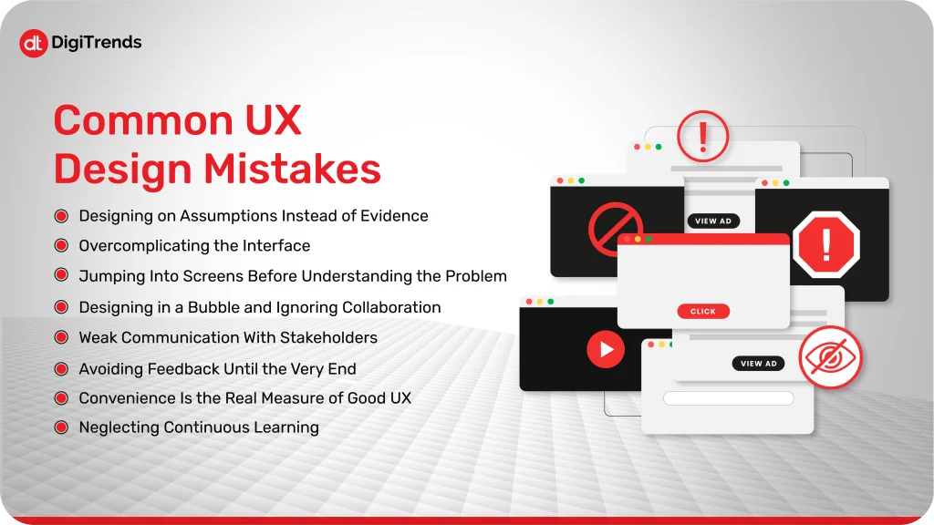
Common UX Design Mistakes
Before wasting any time, let’s dive straight into the most common UX mistakes made by designers:
1. Designing on Assumptions Instead of Evidence
One of the most common UX design pitfalls is when designers and teams assume what users want without doing proper surveys or research. The teams might like the final designs, they might even find the workflow you designed simple and clear, but the thing is that your team isn’t your audience. What might be intuitive and easy for teams might still seem confusing to the target audience.
Imagine if you design a checkout process according to your own habits and understanding. You will know exactly where to click, what to fill out, and what to skip, right? But the real users may get confused on the steps that seem simple and easy, and chances are that they will leave the platform instantly. This will lead to a loss of engagement on the platform, user trust, and ultimately affect the conversions as well.
How to avoid it:
Talk to real users: When a product is being designed, one of the most important things is talking to your users during the process. You can conduct short usability tests or even observe people using the product. This helps in revealing pain points of the users that may not be observed otherwise.
Observe behavior, don’t make assumptions: To observe how the users behave, you can use analytics, heatmaps, or session recordings to have an understanding of where users actually click, scroll, or skip.
Test early and often: You must get validation for your ideas before the full screens are ready. Prototypes are created faster and are enough to point out UX problems before they become a problem later when the screens are fully ready.
If you want to keep your UX design grounded, then you have to make sure that your product aims to solve real user problems, rather than doing what feels right to the team.
2. Overcomplicating the Interface
Another UX design mistake that many designers make frequently is adding too much to a single screen or flow. The thought behind this is to provide users with everything in one place, to make it helpful, but the result is users getting overwhelmed by too much information. Too many buttons, too many options, or too much text can make even simple tasks feel complicated.
For example, you can think of walking into a kitchen to make a sandwich, and you find so many a total mess instead, the clutter will slow you down, right? Some people can’t deal with too much clutter; they hesitate, make mistakes, or leave. The same happens when people find a cluttered site.
How to simplify effectively:
Prioritize core actions: Focus on what users really need to do on that screen and remove anything extra.
Use clear labels and minimal copy: Every word should guide, not confuse.
Break complex tasks into steps: Instead of one overwhelming form, consider a multi-step process with clear progress indicators.
Remember one thing: simplicity does not mean that you’ll have to remove functionality. It is only about presenting the information to users on the right screen, so they can act without any confusion.
3. Jumping Into Screens Before Understanding the Problem
One of the most common mistakes in user experience is to start designing screens before fully comprehending the issue you are trying to solve. Sketching and prototyping are enjoyable, so it’s tempting, but if you don’t have clarity, you could end up creating a lovely solution for the wrong problem.
What if you are working on a user experience for a dashboard, and you have no idea about which information users are mainly interested in? You will spend hours and all your effort in designing the best charts and widgets for the dashboard, but you might end up adding things that users are not even interested in. If your foundation is not right, the efforts will go to waste.
How to avoid it:
Define the problem clearly: Ask what the user needs, why they need it, and what success looks like.
Map the user journey first: Understand the steps users take before you design the screens.
Collaborate early: Involve teammates from product, engineering, and support to make sure everyone agrees on the problem.
Slow down the process; no need to rush into designing. First, understand the problem you are looking to solve to save your time, prevent users from any frustration, and make sure that your design actually solves real user pain points.
4. Designing in a Bubble and Ignoring Collaboration
Working in isolation is also one of the common UX design mistakes. Designers sometimes treat UX as a solo craft, thinking they can “figure it out” alone. The problem with this isolated approach is that products don’t exist in a vacuum. They live within systems, teams, and real user contexts.
What if you, as a designer, created a new appointment booking flow with a lot of hard work and thought, but you didn’t check in with the development team, and weeks later, you find out that the workflow isn’t technically feasible, or it conflicts with another part of the product? Or worse, you design something users struggle with because no one validated it with real feedback. It would be frustrating, right?
How to avoid it:
Involve your team from the start: Share your design ideas with developers, product managers, and support staff from the start.
Collaborate for solutions: Be open to brainstorming and suggestions; this way, you can get fresh ideas.
Keep communication ongoing: Always keep the conversation going so there are no surprises and shared ownership of UX decisions.
Collaboration with the development team will not only improve your product, but it will also save you extra time and cost that goes into reworking everything later. You must be informed from multiple viewpoints to be better informed and get the best results.
5. Weak Communication With Stakeholders
Even if you design the best UX designs, they might fail if no one understands them. What this really means is that if your communication with the stakeholders is weak, it can work as a silent UX killer.
Designers often assume that everyone will get the design as they understand it, but in reality, stakeholders can fail to understand the reasoning behind a designer’s decisions, which might lead to a misunderstanding or pushback from the stakeholders’ side.
Picture presenting a new flow and watching blank stares from the team. Without a clear context, your careful choices can look unnecessary. This misalignment slows down development, creates gaps, and can even ruin the user experience you worked hard to design.
How to avoid it:
Always give reasoning: Always share the reasoning behind design choices, not just the screens.
Use visuals and stories: Short walkthroughs, annotated wireframes, or quick prototypes make ideas tangible.
Keep stakeholders involved: Invite them to user testing sessions or workshops to see user reactions firsthand.
Strong communication ensures your UX decisions are understood, respected, and more likely to succeed.
6. Avoiding Feedback Until the Very End
One of the easiest UX design mistakes to make is waiting too long to get feedback. Many designers polish screens for days or weeks, only to find out that users or team members are struggling with the flow. At that point, fixing design issues gets expensive and frustrating. So, it is really important to get feedback from real users while the project is still ongoing.
Imagine you go ahead with a multi-step checkout that your teams really like, but users are struggling to find the right filter. All the effort that you put in will go to waste because, at the end of the day, users decide the success of your design.
How to avoid it:
Test early and often: Even rough sketches or low-fidelity prototypes can reveal major usability issues.
Encourage open critique: Ask teammates and users to challenge assumptions; it will help you prevent any blind spots.
Iterate quickly: Try to treat feedback as a way to improve your final product and not criticism.
Receiving feedback while the project is still in progress helps keep UX grounded, minimizes future surprises, and ensures that users can truly use the platform without any problems.
7. Forgetting That “Convenience” Is the Real Measure of Good UX
The real meaning of user experience is not a perfect design; it is convenience for users. This is also the part designers often miss when designing user experiences. Designers might get excited over adding flashy features or interfaces that are in trend, and no doubt it makes the design look great, but it also has to be easy to use for the users. Some designs are good visually, but the design makes the usage really difficult for the users, and in this way, even if you have the most perfect design, it will eventually fail.
Imagine you are using an app yourself that has the latest animations and slider, but you struggle to find the form that you went to the website for. You wouldn’t care about the innovation when your task is taking too long to complete, right? Just like this user, they also like to finish what they came to the site for without any extra efforts, so convenience matters a lot more than flashy designs.
How to avoid it:
Focus on the main user tasks: Make sure primary actions are simple and accessible.
Measure success by ease, not bells and whistles: Track completion rates, task time, and user frustration points.
Convenience is like the silent hero of UX. The design only succeeds when users can achieve their goals without thinking twice.
8. Neglecting Continuous Learning
Even highly experienced designers can fall into a bubble of thinking that they already know enough to create the perfect user experience. But the truth is that UX best practices evolve with time, and no designer should ignore the learning part of it.
Imagine relying solely on habits formed years ago. You might overlook new interaction patterns, accessibility standards, or user expectations. What worked last year could confuse users today.
How to avoid it:
Stay curious: Explore new tools, read case studies, and follow UX trends.
Review basics regularly: Refresh knowledge of usability principles, visual hierarchy, and accessibility.
Learn from real users: Analyze behavior, not assumptions, and adapt your design approach accordingly.
Continuous learning keeps your UX sharp, relevant, and ready to meet evolving user needs.
UX Myths vs Reality
UX design comes with a lot of assumptions that aren’t always true. Believing them can lead to costly mistakes. Let’s bust some common myths and set the record straight.
Myth
Reality
Users always know what they want
Users can articulate problems, but not solutions. Your job is to observe, test, and interpret their behavior, not just take requests at face value.
More features mean better UX
Extra features often overwhelm users. Simplicity and focus on core tasks create better experiences.
Aesthetics alone make good UX
A beautiful interface can still be frustrating. Convenience, clarity, and usability always come first.
One-time testing is enough
UX evolves with your users and product. Continuous testing ensures the experience stays smooth over time.
UX is only the designer’s responsibility
UX is a team effort. Developers, product managers, marketers, and support staff all influence the experience.
Breaking these myths helps your team avoid assumptions, focus on real problems, and design experiences that genuinely work for users.
How DigiTrends Can Help
At DigiTrends, we understand that building a product with great UX is more than just designing screens; it’s about creating experiences that users love and return to. As a full-service development company, we combine design thinking with technical expertise to ensure every feature is intuitive, efficient, and aligned with real user needs. From research and prototyping to development and testing, we help teams avoid common UX design mistakes before they reach your audience.
https://digitrends.co/contact-us/Beyond building user-friendly products, DigiTrends integrates continuous feedback loops and usability testing into the development process. This approach allows us to identify friction points early, streamline workflows, and deliver software that’s not only visually appealing but also functional, convenient, and reliable. Whether it’s a web application, mobile app, or complex digital platform, DigiTrends ensures your product provides a seamless user experience while meeting your business goals.
Conclusion
Great UX doesn’t happen by accident. It comes from noticing where users hesitate, testing assumptions, and designing with real needs in mind. The mistakes we covered, from designing on assumptions to overcomplicating interfaces, are easy to make, but equally easy to prevent with the right approach and mindset.
The key takeaway is simple: observe, test, simplify, and collaborate. Focus on convenience, validate your decisions with real users, and never stop learning. When teams keep these principles front and center, UX moves from being a checklist to a true driver of user satisfaction and product success.
Frequently Asked Questions
The biggest mistakes include designing based on assumptions, creating cluttered or complicated interfaces, jumping straight to screens without understanding the problem, ignoring collaboration, and prioritizing looks over convenience.
Signs of bad UX include users getting stuck, abandoning tasks, taking too many steps for simple actions, confusion over navigation, or giving negative feedback.
Yes. Without research, you risk designing for yourself instead of real users. Understanding their needs, behaviors, and context ensures your design solves actual problems.
Often, yes. Overloading screens with too many features overwhelms users. A clean, focused interface that prioritizes core tasks usually provides a smoother experience.
UX should be tested continuously, especially when adding new features or changes. Real users reveal issues that can be fixed early with ongoing feedback and observation.
Submit Your Message
Author :Muhammad Ishaque
I’m a dedicated SEO specialist who propels brands to new heights of online visibility and growth through digital strategies and analytical insights.
Recent Blogs
November 10th, 2025
How Your Business Can Benefit from UX Consulting Services
The best part about UX consulting services is that you won’t have to build a large in-house UX team to make that happen. If you hire a skilled consultant, they will analyze, guide, and help you create a top-notch product.
DigiTrends Recognized as Top Custom Web Design Company in USA for 2024
DigiTrends, a leading US web design company, is thrilled to be named a top web design company by Techreviewer.co, highlighting their innovative and user-centric approach.